TESLANOW app, icon and website
This project was the winning submission to a contest on freelancer.com to design an icon, app and website for an application called 'TESLANOW'.
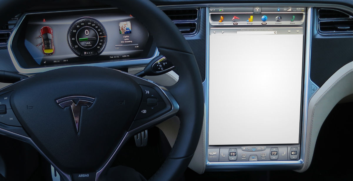
My app designs would be fleshed out to work inside a Tesla's web browser. My website mock up would be created in HTML and CSS with the aim of driving sign ups to the project.


Clean tailor-made icons
Once I had the colour scheme and logo sorted, the icons and other assets came easily.
The flat shadow design was popular at the time and helps make the icons pop.