Website design for a Bristol based marketing agency
As part of a job application, I was tasked with redesigning the website of a Bristol based marketing agency.
The brief stated that the website needed to showcase work to clients, demonstrate their methodology, stand apart from other websites and be reflective of their brand.


An earthy, clean and natural colour scheme
I was given a concept board that included these images as a guideline for the colours and feel that the website could showcase.
I decided my first step should be to choose a colour scheme and using the concept board as a guide, I settled on the below four colours in addition to a heavy use of white.
I chose colours which I felt matched well with the company brand values included in the brief: Authentic - Engaged - Accountable.
#48616e | rgb(72, 97, 110)
#949887 | rgb(148, 152, 135)
#dfe0d2 | rgb(223, 224, 210)
#e2dedf | rgb(226, 222, 223)


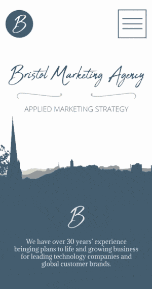
A simple but striking homepage
I wanted the logo to be at the forefront of the homepage layout and I felt the company icon was an easy fit as a navigation link in the header.
I created the vector background using a friend's photo of the Bristol skyline, chosing a vector instead of a photo to keep the file size small.
The landscape isn't identifiable as Bristol's skyline so doesn't narrow a national company down to one area, while keeping the charm of the Bristolian scenery.
Portfolio showcase
As requested in the brief, I wanted to make sure the website's portfolio showcase was particularly striking.
The diamond shape of the images are consistent with the shape of the icons.
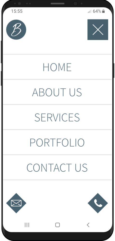
Seemless mobile menu
I created a mock up GIF showcasing tapping the mobile menu button.
A couple of call-to-action buttons at the bottom of the mobile menu make contacting the agency simple.
Adamina Regular
Aa Bb Cc Dd Ee Ff Gg Hh Ii Jj Kk Ll Mm Nn Oo Pp Qq Rr Ss Tt Uu Vv Ww Xx Yy Zz
1 2 3 4 5 6 7 8 9 0
! ? # @ ( ) & £
For the primary font, I chose Adamina Regular as I think it best reflected the elegence, mood and feel of the images provided in the concept board.
I felt it was also important to me to pick a font that could be easily implemented through Google Fonts.
Source Sans Pro Light
Aa Bb Cc Dd Ee Ff Gg Hh Ii Jj Kk Ll Mm Nn Oo Pp Qq Rr Ss Tt Uu Vv Ww Xx Yy Zz
1 2 3 4 5 6 7 8 9 0
! ? # @ ( ) & £
I felt Source Pro Light would be a strong choice as a font for all UI aspects and some headers.
While being clearly readable, its light weight helps it avoid clashing with the serif font Adamina.
Source Sans Pro Semibold
Aa Bb Cc Dd Ee Ff Gg Hh Ii Jj Kk Ll Mm Nn Oo Pp Qq Rr Ss Tt Uu Vv Ww Xx Yy Zz
1 2 3 4 5 6 7 8 9 0
! ? # @ ( ) & £
Source Sans Pro Semibold was the typeface I was least sure about being the right fit for the project, but I envisioned it being used sparingly and only on Call to action buttons.